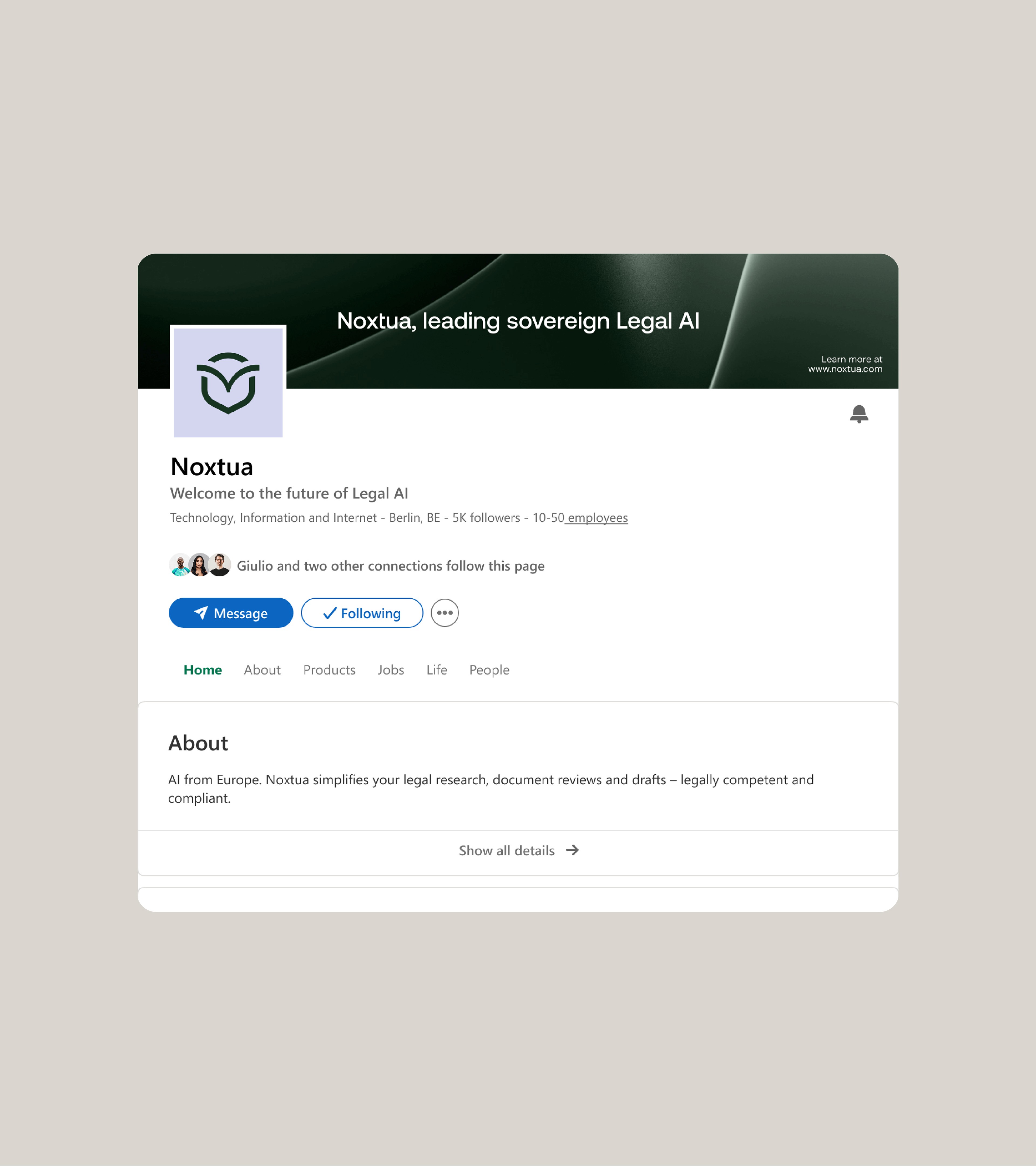
Noxtua is a sovereign legal AI built in Europe, an AI that helps lawyers work faster while keeping their data on European soil. It gives legal teams the speed of AI without the risk of sending sensitive information somewhere it shouldn't go.
We built the full brand and digital identity around a single idea: earned trust. The logomark carries two meanings at once, an owl for wisdom and judgment, drawn as a shield for protection and sovereignty. One symbol that says the two things a legal AI has to prove before anyone will use it: it's smart, and your data is safe.
From there we built a system designed to feel as considered as the product itself. Every choice, the confident wordmark, the deep forest green, the restraint, was made to signal intelligence, calm, and trust, the same qualities Noxtua promises the firms that rely on it. Nothing decorative, nothing arbitrary. A flexible system holds the brand together across web, product, social, and out-of-home, so it stays unmistakably itself everywhere it appears. For a tool built on trust, consistency isn't a nice-to-have, it's the whole argument.
The website carries the identity into motion, presenting a serious enterprise tool in a way that feels approachable rather than cold, so visitors sense the intelligence and the safety before they read a single feature. The result is a brand that feels as precise, trustworthy, and European as the technology behind it.
Noxtua raised €80.7M after the rebrand.
Year
2026
Industry
AI, Legal
Project Direction
Branding Strategy, Logo, Brand Identity, Web Design, Design System